 In less than two months the 2010 Shanghai World Expo will start its six-month run. As I’m slowly catching Expo Fever, I thought I’d run through a few of my favourite pavilions, comparing and contrasting what the official word on the structure is with my amateur thoughts and opinions.
This list is by no means a complete list of pavilions or “good” pavilions. Rather, it is a list of the pavilions that stuck out to me in my random browsing of the Internet and the official World Expo Shanghai 2010 Web site.
In less than two months the 2010 Shanghai World Expo will start its six-month run. As I’m slowly catching Expo Fever, I thought I’d run through a few of my favourite pavilions, comparing and contrasting what the official word on the structure is with my amateur thoughts and opinions.
This list is by no means a complete list of pavilions or “good” pavilions. Rather, it is a list of the pavilions that stuck out to me in my random browsing of the Internet and the official World Expo Shanghai 2010 Web site.
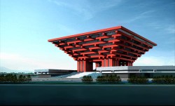
China

They Say: The China Pavilion is designed with the concept of “Oriental Crown.” The traditional Chinese wooden structure element, Dougong brackets, is introduced. Its main colour is “Gugong (Forbidden City) Red” which represents the taste and spirit of Chinese culture. China’s achievements in urban development from ancient to modern times will be the core theme of the pavilion.
I Say: It looks awesome, truly. I love the traditional style and imposing design — two things that describe China well. Its China’s expo, and understatement is not needed nor expected in my opinion. I think its top-down concept is cool, and with the amount of pressure on the country to have a good showing, the pavilion is sure to be a highlight of the event.
Hong Kong
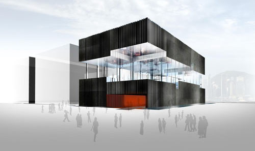
They Say: It will be a three-story 600-square-meter metallic-colored structure beside the 20,000-square-meter China Pavilion, known as the “Crown of the East.” The second floor of the pavilion will be transparent. The pavilion will symbolize the imagination and creativity of Hong Kong people. The pavilion will feature an indoor wetland park on the third floor replicating the Hong Kong Wetland Park in downtown Tin Shui Wai, New Territories, which opened in 2006. Famous Hong Kong pop stars will be around the pavilion during Expo and visitors will able to talk and take photos with them.
I Say: Next to the main China pavilion I can’t help but feel this looks a bit like a trailer. Still, the modern look works well in contrast to the more traditionally-flavoured “Crown of the East” and mirrors the divides between HK and the mainland.
Macau
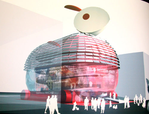
They Say: It has been designed to look like a rabbit lantern sitting under China’s national pavilion. The Macau pavilion will be covered by a double-layer glass membrane and fluorescent screens. Kinetic balloons will form the head and tail of the “rabbit.” In Chinese mythology, the jade rabbit welcomes visitors to a magical fairyland.
I Say: I can’t believe there wasn’t at least one guy in the planning committee that didn’t stop and go, “Wait, wait, wait. It’s a fucking bunny. Seriously?” In the pros column, maybe they’ll give out free chocolate eggs inside.
United Kingdom
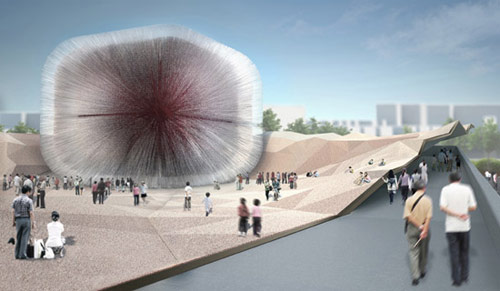
They Say: The 20-meter-high cube-like Seed Cathedral will be covered by 60,000 slim, transparent acrylic rods, which will quiver in the breeze. Each 7-meter-long rod contains a certain type of seed, a call from the UK to protect natural species and the future of mankind.
I Say: This, to me, is what the World Expo is all about — awesomely odd looking buildings that you would never build for any other reason but a World Expo. That it looks like a giant Koosh Ball makes it all the cooler.
Saudi Arabia
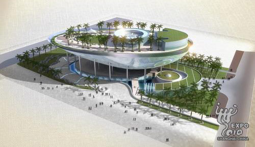
They Say: They will plant 150 date palms, which are common in the desert country, on the roof of their pavilion. The trees were transplanted to Zhejiang Province and will be replanted on the roof of Saudi Arabia Pavilion as soon as construction is finished. It may end up being the most expensive pavilion at World Expo 2010 as the Middle-East country said it has no budget limit. The pavilion is a combined effort of Chinese and Saudi designers. The pavilion has a “moon boat” shape and is surrounded by deserts and seas, just like Saudi Arabia. The pavilion’s main attraction will be a huge cinema screen. The 1,600 square-meter screen will be larger than any other cinema screen on earth.
I Say: I like the oasis feel. Disappointingly, but perhaps unsurprisingly, the pavilion seems more about showing off the country’s wealth than any sort of concerted effort to work towards the theme of the expo or relay its culture on a world stage.
Turkey
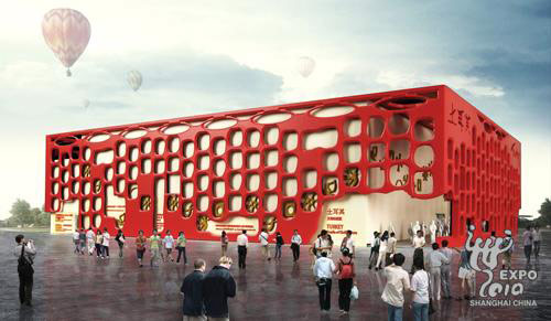
They Say: The main inspiration for the exterior of the 2,000-square-meter pavilion was derived from settlements called “Catalhoyuk” in Turkish, which were the center of advanced culture in the Neolithic period. The pavilion looks like an amazing red and beige box with an animal sculpture, inviting visitors to explore a maze of dreams. The first section of the pavilion will take visitors through a journey of time to learn about Turkey’s historical firsts. A map indicating the ancient sites of Turkey, the world’s first mirror and the world’s first man-built dam will be featured here.
I Say: It’s a bit goofy looking, but I like it. I also like that the country has worked hard at integrating its history and culture tightly with the theme of the expo.
Romania
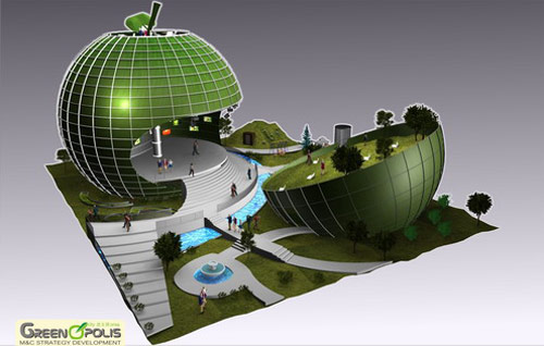
They Say: It will take the shape of a green apple in its focus on a “green city” concept. The pavilion will cover 2,000 square meters and its apple shape and logo “Greenopolis” reflect the importance of healthy lifestyle, sustainable development and knowledge-based solutions for modern society, Romanian officials said.
I say: The “green apple” = “green city” thing is a bit of a stretch, and it is definitely in the same camp with Macau for taking nature in architecture a step too far. But it wins points for being unique. The unofficial Romanian slogan for the expo should be “at least we’re not a f’king bunny.”
Brazil
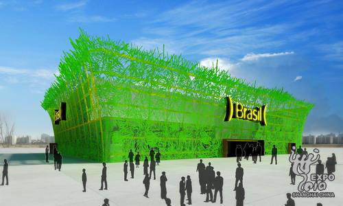
They Say: The nation will show off the cultural diversity of Brazilian cities, their dynamism and, of course, the ever-present football with the theme “Pulsing Cities: Feel the Life of Brazilian Cities.” The pavilion will highlight the transformation of Brazilian cities in search of urban solutions that result in sustainable development and wellbeing for citizens.
I Say: It sort of looks like a Rainforest Cafe crossed with a netbar, but I’ll visit it. The exterior doesn’t do much justice to the promising video displays inside. And there’s got to be at least a few visual references to Brazilian beaches, doesn’t there?
Denmark
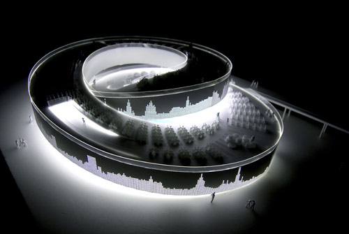
They Say: The pavilion, called “Welfairytales” – a blend of the words “welfare” and “fairy tales” – will feature a salt water pool filled with water from the Danish harbor. Thogersen said the harbor suffered industrial pollution 20 years ago, but had been purified and now local people even swim at the sea, which is a “good showcase of Denmark’s style of sustainability.” The pavilion will showcase a fairy tale world with the Little Mermaid, the country’s symbol, set to make her first visit to Shanghai in 2010. The Little Mermaid statue is one of Denmark’s major tourist attractions and sits on a rock in Copenhagen harbor. The winning team behind the design of the pavilion hopes to bring it to Shanghai.
I Say: That’s one cool looking danish. I’ve not heard of any other countries dismantling national treasures to bring to the expo, so extra points for that. Plus it’s said to contain 1,500 bikes that are presumably available for loan to visitors. Those wacky Danes and their bikes. Designboom has a good review of this rather rad pavilion.
Israel
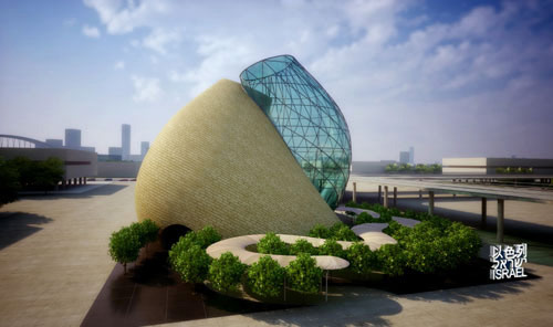
They Say: The pavilion consists of three areas — Whispering Garden, Hall of Light and Hall of Innovations. The Whispering Garden is a green orchard that greets visitors as they enter the building. Some facilities will be installed to make the trees begin to “whisper†in both English and Chinese when visitors walk close to them. The hall of Light includes a 15-meter high screen, which will display films highlighting the country’s innovations and technological achievements. The Hall of Innovation is the centerpiece of the Israel Pavilion. A special audio-visual show will allow visitors to talk with Israeli children, scientists, doctors and inventors via hundreds of screens. These Israelis will introduce themselves and share their hopes for a better future.
I Say: This is Israel’s first World Expo pavilion, and they’ve done well. Looking at the structure, it just feels like buildings in the future could look like this. As my picks here reveal, I heavily favour the designs that feature smoother, flowing architecture over big block buildings — and I think the Israeli pavilion looks great in this regard. Update: Thanks to Francois for pointing out that Israel had a pavilion in Montreal ’67 – not sure why the documentation for their pavilion says otherwise, or maybe I misunderstood it.
Switzerland
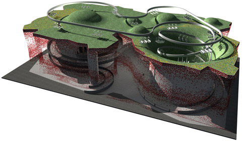
They Say: The Swiss Pavilion is inspired by the concept of balance, as embodied in the traditional Chinese concept of yin and yang, which is relevant to the sub-theme of the Expo “rural-urban interaction.” Rural and urban areas are complementary yet opposing, and the combination of the two ensures a balance between society and nature. A regular and healthy interaction between the rural and urban areas is a prerequisite for sustainable and harmonious development in ecological, economic and social aspects.
I Say: In contrast to the Chinese pavilion, which will focus on migration from China’s rural past to a more urbancentric future, I like how the Swiss pavilion is stating that the two can be blended. Though if some of the neighbourhoods I’ve lived in here in China are an indicator, the Chinese are way ahead in urban farming.
United Arab Emirates
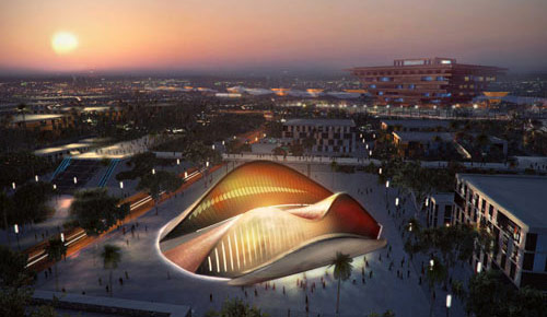
They Say: The UAE pavilion is based on the form of a sand dune. The pavillion is a reference to this symbolic feature of the
desert landscape shared by each of the seven emirates. Like a sand dune, the pavillion appears rough and textured on the side that bears
the full force of the wind and smooth on the other side. The northern elevation is more porous to admit natural light, while the southern elevation has a solid facade, to minimise solar gain.
I Say: Pretty cool eco-friendly pavilion with a unique country-related design. And don’t believe the rumours, it definitely looks nothing like a vagina. Definitely.
Italy
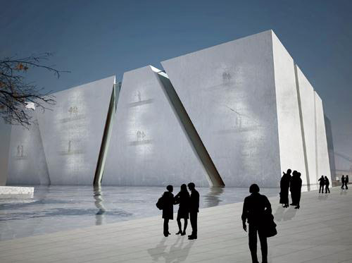
They Say: Its design was inspired by the children’s game “pick-up sticks,” which is known as “Shanghai” in Italy. The rectangular pavilion will be laced with intersecting lines – representing pick-up sticks. The 3,600-square-meter structure comprises 20 functional modules of different shapes, bounded by the “sticks.” They represent Italy’s 20 regions. The modules can be assembled into smaller structures. After the Expo, the building will be disassembled and reconfigured.
I Say: I almost discounted this pavilion because, as I mentioned above, I really dislike big blocky looking buildings. The Italians have a way with things though and did well with their design. The frigin’ thing features translucent concrete, and that is way cool. Plus its cross-cultural “pick-up-sticks”/”Shanghai” tie-in is clever.
France
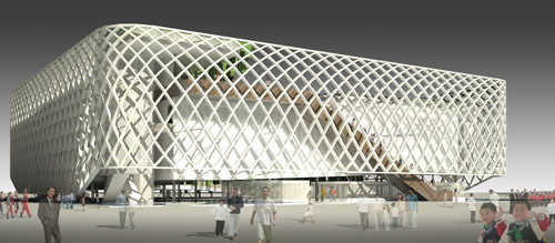
They Say: The final design, “the Sensual City,” selected from 49 candidates, presents a simple building with a big French-style garden inside. Surrounded by water, it appears to be floating.
I Say: I like the ultra-modern mesh look and large garden/green-space inside.
Germany
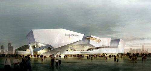
They Say: The 6,000-square-meter structure will be Germany’s largest at any Expo and will comprise three exhibition areas which will showcase German urban life and how the country’s design and products can help solve urbanization problems. The theme of the pavilion is “Balancity.” It will demonstrate the importance of balance between modernization and preservation, innovation and tradition, community and the individual, work and leisure, and between globalization and national identity. Pavilion architect Lennart Wiechell said the highlight of the pavilion will be a cone-shaped structure housing a revolving metal sphere, 3 meters in diameter and covered with 30,000 LEDs, which will be activated by the noise and movement of spectators.
I Say: I just really like the design. Unique angles and moving parts are cool. Overall the theme of balance is neat too. Curious to see what solutions the Germans have to the issues of balance — particularly the balance between work and leisure. Hopefully it doesn’t involve getting lobster tans in Speedos at the workplace.
Shanghai Automotive Industry Corp and General Motors
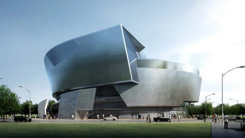
They Say: The 6,000-square-meter pavilion will explore the theme “The Road to the Future” with a vision of a safe, convenient and intelligent traffic system within 20 years. Visitors will see what vehicles might look like in 2030.
I Say: The company is making comparisons to its showing at the 1933 World Expo in which it touted the concept of a “freeway”. Ironically, North America’s over-dependence on automobiles, and shunning of mass-transit are perpendicular to the Shanghai Expo’s theme of “Better City, Better Life”. Hopefully the Road to the Future tackles this. Likely it will just be a showcase for some rad looking cars. Meh, that’s ok too.
ROK Joint-Corporate Pavilion
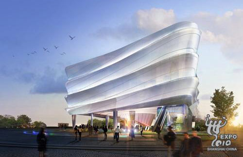
They Say: The ROK Joint-Corporate Pavilion is being built by 12 South Korean companies, including Samsung, E-mart and LG and the theme of the pavilion is “Green City, Green Life”. The 3,000-square-meter pavilion is a cube with spirals. The design is inspired by the skirts of a dancing ROK woman wearing traditional costume.
I Say: Feels like a pleasant and non-ostentatious design that suits the bank of the Huang Pu well.
Obviously Missing From The List
There are two pavilions that I’ve not included above because, well, they do nothing for me. However, I’d be remiss if I didn’t at least mention them.
USA
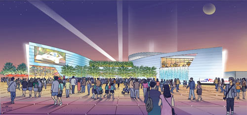
They Say: The USA Pavilion will showcase sustainability, teamwork, health, struggle and achievements.
I Say: Showcase teamwork and achievement? I mean, struggle, sure. But most of the other stuff is laughable. For an excellent rundown on the clusterfuck that went into the American pavilion, check out “A Sorry Spectacle: The uninspiring saga of the United States’ World Expo pavilion in Shanghai” by Adam Minter. As for the design itself, I’ve seen more inspired movie theatres.
Canada
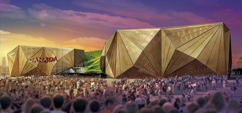
They Say: The Canada Pavilion, among the biggest at the site, will feature an exhibition themed “The Living City: Inclusive, Sustainable, Creative.” The pavilion is about the size of two-and-a-half NHL ice hockey rinks. The pavilion will be anchored by an open public place and surrounded by three large structures. The square will be a performing area, where visitors can watch the performances of Cirque du Soleil before checking out the pavilion.
I Say: It’s a given that this Canuck will be visiting his country’s pavilion, whether the design of it inspires him or not. I’ve never seen any of the incarnations of Cirque du Soleil and so that’s a possible bonus of attending, as is potentially catching a glimpse of Da Shan, or “Mr. Mark H. Rowswell“, as he’s officially known in the role of the Commissioner General for Canada at Expo 2010 in Shanghai (seriously, that’s the actual length of his title). There’s a lot of controversy in Canada over the pavilion, and its design having been awarded to a circus over an architect. I don’t think it’s that bad, but it’s also not anything we’ll be bragging about for decades to come.
So that’s my list. What are your favourites?


By the way, The Canadian pavillion wasn’t “designed by a circus”. They commissioned the same architect who made the HEC Montreal, and the Pointe-a-Callieres museum, among others. (the latter being pretty nice, former being utter crap).
According to the Globe & Mail article referenced above the pavilion was designed by Cirque staff member Johnny Boivin.
The actual construction (and sorting out how to make sure it doesn’t fall down) was, of course, handled by a real architect, or architects, as it were. ABCP themselves say nothing about “designing” it, but rather refer to it as “the architectural realization of the pavilion.” Which is either being careful to give paid and proper credit, or distancing themselves from the design.
Rochon’s article mentions Saia Barbarese Topouzanov Architectes as “finessing” the design, it it still seems all initial design credit goes to Boivin and in-house Cirque.
“There’s a lot of controversy in Canada over the pavilion, and its design having been awarded to a circus over an architect. I don’t think it’s that bad, but it’s also not anything we’ll be bragging about for decades to come.”
Yeah and there was a lot of controversy about the Vancouver Olympics – and look how that ended…..oh i forgot Ryan , you were the heretic that actually didn’t watch the gold medal hockey game that gave Canada the highest gold count in winter Olympic history…;-) (you do know which level of hell dante said was reserved for traitors…..)
Level Zee?
Level Zed…cheers, all in good jest, Ryan.
Besides being a Shanghai resident my business is quite involved in Expo and I’ve had my fill already.
Norway pavilion looks pretty good – and i cant wait to see the “oil” pavilion (so much for sustainability)
Wow, a good review of what we’ll see (I hope!) Any details on the Life and Sunshine Pavilion? It’s supposed to be “a first” in Expo history…
Great run through, fun commentary. To my eyes, the Polish pavilion is just a flat-out gorgeous piece of architecture. Not enough emphasis on doing pretty at this Expo. Image, here:
http://www.designboom.com/weblog/cat/9/view/2223/polish-pavilion-for-shanghai-expo-in-2010.html
I’m also partial to the Russian pavilion and – like just about everyone – I think the Dutch pavilion (named, unfortunately, “Happy Street”) is terrifically fun. Here:
http://www.holland-expo2010.com/
I’m a bit of a defender of the Canadian pavilion. That red cedar exudes a bit of rustic charm when you experience it in person (I have). No, it’s not the UK pavilion, but it works as a building. Nothing to be ashamed of at all.
Agreed, the Polish pavilion looks great — would definitely have been on the list above. For posterity, here’s an image of it for those too lazy to make the jump.
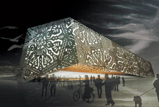
As for the Canadian pavilion, I’m completely willing to reserve judgement until I see it for myself. As with most of these “artist renderings”, it’s a challenge to gauge what the building will actually look like when in place with real-life textures and surrounded by other buildings.
And which ones of these will be ready on time ?
— Woods
I’m really ashamed about the the incompetence and lack of imagination that has gone into the USA Pavilion. Great post BTW.
I think one key discussion is missing: the architecture of the park. While individual countries have better and worse designs, they’re merely features that fix together in a surrounding. I’m surprised not much discussion seems to have gone into that surrounding, the park, and how bland it is.
I have to say I’m less distressed about the US’s bland pavilion and more about the gargantuan amounts of money that are being vomited into this shameless spectacle of nation-branding. As always, the leaders of the world pump gazillions of dollars into showing off how marvelous their respective countries are rather than actually trying to tackle any problems. The countries that are focusing on using their pavilions to present such issues have my hat off to them, regardless of how much money they’re wasting on the silly buildings. Having said that, there are some really amazing marvels of modern architecture being constructed. I’m curious to see who’s there to make positive change and who’s just there to say, “Look at us! We’re awesome!” See you all there.
THE GREATEST ONE, UKRAINIAN PAVILION:
http://www.russianshanghai.com/wp-content/uploads/2010/02/00.jpg
LOL!
Pingback: Shanghai Scrap » Travel Week – Offline Until March 22
Pingback: headseast » Blog Archive » Shanghai Expo 2010…
I take the Romanian one all the freakin’ way!!!! The green apple is definitely the best. And by “best” I do mean “weirdest one that I will take the most strange pictures of”.
But the Canada one does have Tim Horton’s, which will make it the one that I frequent the most. I don’t really see why it’s so controversial, but then again the biggest controversy in Canada right now is an MP that was rude to airport staff…seriously.
is anybody but me worried that with 70 million attendance plus the local population of Shanghai… hmm that’s close to 100 million… that Shanghai might sink into the ocean? 😛 hope everybody can swim…
Glen, sorry to burst your bubble but there won’t be a Timmie’s in the Canada Pavilion in Shanghai
Pingback: Hao Hao Report
1) Is America just trying to prove to the world that our country now barters exclusively in Bullshit?
2) About Israel’s building…I’m pretty sure that their design team is full of starcraft fans, cause it that’s not a Protoss building I don’t know what is. Keep in mind that the last time I played the game was 12 years ago and I made the connection within five seconds ==> http://illsmokum.tripod.com/thehive/id33.html
3) Spot on with the description of Brazil’s offering…I would add that it could also be said to look like a second grade project for the social studies chapter on dinosaurs…sans dinosaurs, of course.
Re: #2 Totally! Speaking of more than a decade old — wow, tripod.com sites are still going? Next someone will tell me GeoCities is still offering free ad-laden site space (really, I don’t need links).
#3 would be way cooler if they had dinosaurs. Pretty much everything would.
it seems the whole thing will be a reliable continuation of the Hannover Expo 2000 and the Beijing Olympics in terms of architecture: architects’ wet dreams for use-once-throw-away buildings dropped onto a desert of concrete and trees that should have been planted 6 years ago… I fondly remember being astonished by the Munich Olympic area, where fabulous architecture met astounding landscaping – and that was 40 years ago! I can already feel my depression of walking through this zoo of monstrosities welling up …
The Australian pavilion is definitely worth a mention here – I like the story behind it and the balance between natural environment and innovative construction.
Visually, the deep red-ochre colour is really striking, unique and evocative of the Australian outback. The colours have developed in a natural way and will change throughout – the facade is actually made of a special weathering steel and the colours have come about through a process of natural rusting!
http://www.australianpavilion.com
I notice in the list a lot of European Pavilions and I suggest this website : http://www.2010Shanghai.eu which has quite a lot of interesting Information and News about each European Country Pavilion + EU cities in UBPA.. Web2.0 pages on the website could be updated.
Pingback: The Expo is coming to Shanghai! | CHINAYOUREN
can’t wait to be there~ ambicious as usual! 🙂
xx
Why do people keep whinging about the Canadian pavilion? It’s not like the guy sat alone in a room with no help whatsoever from anyone else. He would have had help from numerous qualified sources and probably alot of guidance. Stop with the hating already.
Why? Because, we can do better. Arthur Erickson designed the Canada pavilion for Expo ’70 in Osaka and it won the award for best architecture. The Canada pavilion for Expo ’86 is Vancouver’s main landmark building today. That said, we had a bland box pavilion at Expo ’92 in Sevilla and it was still the most popular one because we’re really good at giving visitors an interactive experience instead of just watching videos. I’m sure in Shanghai it’ll be the same.
The Canada Pavilion is not something you can look at a picture of and say “wow” but the design elements are there. Canada will be all about experience. Even just standing around the pavilion, the whole place will have a wonderful cedar aroma from the wood paneling covering the building’s sides. Canada’s also bringing out a lot of talent to entertain the crowds. Not sure how they’re engaging “Better City, Better Life” though, maybe an exhibit about oil sands or our American-focused defense industry?
Anyways, very sad the Korean Pavilion isn’t mentioned here. A very design-focused article is missing one of the most interesting concepts of all.
Loved your critique, Ryan! I talked about it on our site one9ninety.com! Looking forward to reading more of your posts 🙂
Pingback: Fact or Fiction: Edition IV | Lost Laowai China Blog
Pingback: World Expo Shanghai 2010 « curiouser every day
China Pavilion FTW.
Canada Pavilion sucks, it’s true.
Yea the Canada pavilion isn’t up to par :). Both the China and Romania pavilions look so cool!
I like your expressions on what you think about the pavilions. It’s great. It is brainstorming. I am recording my experience in Shanghai Expo 2010. You may consider visiting my blog http://2010shanghaichina.blogspot.com There are lots of images and videos on my blogs. See what you think.
Pingback: One9Ninety | ExpOpinions: A Blogger’s Fun Critique of Some Shanghai 2010 World Expo Pavilions
Beautiful dance between form and function. I like Israel’s best 😉 All are simply exquisite! Great Job people.